Acclaim Renovations & Design backs that claim with quality workmanship and superior installation skills

By Patricia Nugent
The decades-old kitchen design theory of “the golden triangle,” which stipulates a kitchen’s three main working areas—sink, refrigerator and stove—should form a perfect triangle, makes good sense in terms of its ultimate functionality.
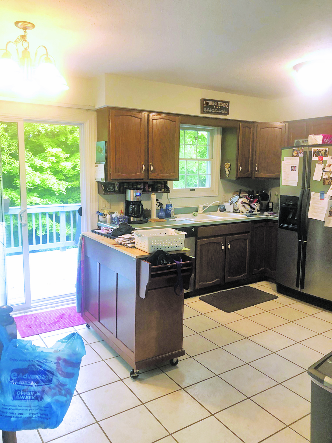
In Irene C.’s kitchen, in Concord, the relationship between the three was so far off base it didn’t even form a triangle. Her refrigerator was situated right next to her oven, and she couldn’t open the oven door if the fridge door was open.
Something had to be done.
She and her husband reached out to Acclaim Renovations & Design for a kitchen makeover.
Irene, who is an accountant, reports that she relied heavily on the designers for the creative direction—and they did not disappoint.

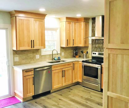
“I love the look of natural wood,” she reports. “They showed me many samples of natural maple, unstained with just a clear coating so you can see the grain. It was a huge improvement over the existing cabinetry, which was dark and felt like plastic. I would say my old cabinets were a step or two below builder’s grade.”
The designers decided to move the refrigerator to the adjacent wall, to give the stove and sink plenty of room for workspaces and accessibility.
“They also added loads of storage space by getting rid of our soffits, installing larger cabinets, and creating beautiful natural wood crown molding above them,” she says. “Once the square space was finished, they went the extra mile and recommended two movable islands on wheels, which we can use for entertaining and then store underneath more cabinets they created on the other wall of the kitchen overlooking the family room.”
She said they also came up with the idea of making the freestanding stainless-steel range hood a focal point of the room, creating a contrasting backsplash with black and gray glass tiles laid vertically instead of horizontally. They perfectly complement the natural rough stone, sand-colored rectangular tiles that make up the backsplash in the rest of the kitchen, as well as the pale taupe quartz counters.
Lighting also played a key role in the renovation, with the designers opting for abundant ceiling lights to spotlight the cabinets and work areas.
“The new lights look like recessed cans, but they are actually LED wafer lights, which are thinner, adjustable and add superior, long-lasting light,” she says.
The home, which was built in 1974, now boasts a modern and bright kitchen that allows Irene and her husband to enjoy all the functionality of a high-end kitchen.
The Difference Workmanship Makes
Bob Gallese owns Acclaim Renovations & Design and has been in the industry more than 40 years. In that time he has made it his business to only hire master craftsmen who share his pride in workmanship.
With Irene’s job, they hit a snag when they discovered moisture damage to the sub-flooring underneath her ceramic tile, which they initially had chosen to refinish instead of replace. The answer was selecting a natural wood look LVT, which pulled everything together.
“Our guys are innovative, creative and resourceful,” he says. “There’s nothing that can happen on a job that they haven’t already encountered.”
In the end, Irene says she was impressed with their level of professionalism from beginning to end, noting the workmen ensured the home was immaculate before they left each day.
Acclaim Renovations & Design powered by One Man and a Hammer is located at 8550 East Avenue in Mentor. The company has been awarded Contractor of the Year by NARI (National Association of the Remodeling Industry). Call 440-974-8082 or visit AcclaimReno.com.
